InfoAlign: A Human-AI Co-Creation System for Storytelling with Infographics

Jielin FengXinwu YeQianhui LiVerena PrantlJun-Hsiang YaoYuheng ZhaoYun WangSiming Chen

article2026International Conference on Human Factors in Computing Systems4 citations

Introduces InfoAlign, a human-AI co-creation system that transforms unstructured text into coherent storytelling infographics through a structured workflow of story construction, visual encoding, and spatial composition while preserving user intent.

Listen

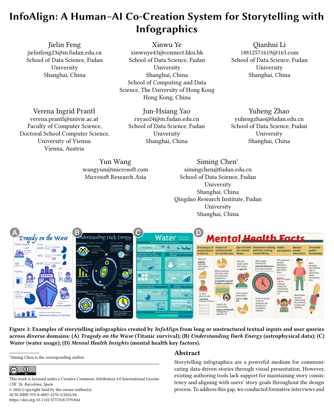
Data-driven visual communication frequently relies on infographics to translate complex narratives into engaging and digestible formats. However, existing design tools struggle to maintain story consistency across the multi-step authoring process and often fail to preserve user intent. Highly automated tools typically produce rigid, disconnected outputs, while traditional software requires extensive manual effort to align narrative structure, visual assets, and spatial layout.

The article develops and evaluates a narrative-centric workflow and an interactive system, named InfoAlign, designed to turn long or unstructured text into coherent visual storytelling infographics while supporting human-AI co-creation.

To establish design requirements, the researchers conducted formative interviews with eight professional creators and analyzed a curated corpus of 70 real-world storytelling infographics to identify layout and narrative patterns. Based on these insights, the authors designed a three-phase workflow combining large language models for story structuring and asset suggestion with rule-based optimization algorithms for spatial composition. The resulting system guides users through story construction, visual encoding, and layout arrangement while maintaining an editable canvas for interactive refinement. The system was then evaluated through a task-based user study involving 12 participants creating full infographics from various textual datasets.

The evaluation produced several key findings regarding narrative quality and user interaction. First, the automated narrative extraction demonstrated high structural quality and reliability, with 95% of generated story pieces rated as coherent with the story goal and 95.73% of extracted details verified as strictly factually accurate against source documents. Second, participants favored intervening selectively: modification rates were highest for expressive elements like text highlights (41.0%) and icons (39.3%), whereas factual text (17.9%) and chart structures (4.0%) were largely retained as recommended. Third, the hybrid authoring model proved efficient, enabling users to complete end-to-end professional infographics in an average of 20.3 minutes. Finally, system effectiveness scored consistently high on 7-point scales across usability (6.27), creativity support (6.31), perceived co-creation (6.10), and visual aesthetics (6.17).

These results demonstrate that combining automated narrative scaffolding with flexible, step-by-step human intervention provides a practical balance between productivity and authorial control. Rather than relying on end-to-end generation that frequently misaligns with spatial and narrative constraints, employing rule-based spatial layout alongside AI-driven content extraction reduces production overhead while preserving user intent and communication goals.

Organizations producing data-driven communications should explore narrative-centric, hybrid-AI workflows to lower the technical barrier and time required for content generation. For system developers, prioritizing transparency by providing explanations for AI recommendations—such as styling or layout logic—and integrating fine-grained graphic editing capabilities will further enhance user trust and creative flexibility. Future initiatives should focus on extending this narrative approach to broader formats such as slide presentations, video summaries, and multimodal data sources.

While the findings demonstrate strong effectiveness, confidence in the results should be contextualized by the small study sample size of 12 participants and the use of qualitative self-reporting during guided tasks. Additionally, the system is optimized primarily for textual inputs, meaning complex quantitative tables currently require text-based pre-processing.

Cover for InfoAlign: A Human-AI Co-Creation System for Storytelling with Infographics

Abstract

Storytelling infographics are a powerful medium for communicating data-driven stories through visual presentation. However, existing authoring tools lack support for maintaining story consistency and aligning with users' story goals throughout the design process. To address this gap, we conducted formative interviews and a quantitative analysis to identify design needs and common story-informed layout patterns in infographics. Based on these insights, we propose a narrative-centric workflow for infographic creation consisting of three phases: story construction, visual encoding, and spatial composition. Building on this workflow, we developed InfoAlign, a human-AI co-creation system that transforms long or unstructured text into stories, recommends semantically aligned visual designs, and generates layout blueprints. Users can intervene and refine the design at any stage, ensuring their intent is preserved and the infographic creation process remains transparent. Evaluations show that InfoAlign preserves story coherence across authoring stages and effectively supports human-AI co-creation for storytelling infographic design.

Table of Contents

  • 1 Introduction
  • 2 Related Work
  • 2.1 Generative AI for Visualization
  • 2.2 Infographic Design
  • 2.3 Narrative Visualization
  • 3 Formative Interview
  • 3.1 Findings
  • 3.2 Design Requirement
  • 4 Layout Design-Space Analysis
  • 4.1 Data Preparation and Coding Process
  • 4.1.1 Data Collection and Filtering
  • 4.1.2 Term Definitions
  • 4.1.3 Coding Procedure
  • 4.1.4 Final Dataset and Analysis Measures
  • 4.2 Layout Patterns for Storytelling Infographics
  • 5 InfoAlign
  • 5.1 Narrative-Centric Workflow
  • 5.1.1 Story Construction
  • 5.1.2 Visual Encoding
  • 5.1.3 Spatial Composition
  • 5.2 System
  • 6 User Study
  • 6.1 Participants
  • 6.2 Study Design
  • 6.2.1 Tasks and Materials
  • 6.2.2 Procedure
  • 6.2.3 Measures
  • 6.2.4 Study Limitation
  • 7 Results
  • 7.1 Workflow-Level Story Consistency Across Creation Stages
  • 7.1.1 Aligning Story Goals and Constructed Stories
  • 7.1.2 Story-Aligned Visual Design
  • 7.1.3 Story-Informed Spatial Composition for Coherent Reading Flow
  • 7.2 Human–AI Interaction Patterns Across Authoring Stages
  • 7.2.1 Integrating Story Goals and Creator Intent through Human–AI Co-Creation
  • 7.2.2 Efficiency of Stepwise Human–AI Infographic Authoring
  • 7.3 Overall Effectiveness of InfoAlign
  • 8 Discussion
  • 8.1 Implication
  • 8.2 Limitations and Future Work
  • 9 Conclusion
  • References

Knowls

  1. Knowl 1 — Narrative-centric workflow for infographic creation

    model/method

    InfoAlign introduces a narrative-centric workflow that preserves a user’s story goal across three dependent phases: story construction, visual encoding, and spatial composition. The input is long or unstructured text together with a user query defining the intended story. Story construction extracts relevant story pieces and data-driven story units; visual encoding maps each story unit to semantically appropriate visual designs; spatial composition arranges those designs into a layout whose reading order reflects the story structure.

    The workflow combines large language models with rule-based layout algorithms. Large language models perform textual extraction, narrative structuring, semantic labeling, highlighting, chart selection, color and font recommendation, and icon prompting. Rule-based algorithms handle layout recommendation and blueprint generation because layout must satisfy coupled constraints involving reading order, story-piece density, inter-piece connections, element sizes, and overlap avoidance. Users can intervene after each phase, so the generated artifact remains aligned both with the original story goal and with the creator’s evolving intent.

    The workflow operationalizes five requirements derived from formative interviews with eight infographic creators: support long or unstructured text plus user queries; construct a coherent story; recommend visual designs aligned with the story and user intent; recommend layouts that guide reading flow without rigid templates; and provide human control for refinement at every stage.

  2. Knowl 2 — Hierarchical story representation and layout taxonomy

    definition

    InfoAlign represents a storytelling infographic hierarchically. A Story Piece (SP) is a narratively related section associated with the infographic’s story goal. A Story Unit (SU) is a distinct data insight extracted from one Story Piece. A Story Unit is expressed through multiple Visual Designs (VDs), including highlight text, regular text, icons or graphics, and charts.

    Story Pieces are connected to the overall story goal and to one another through narrative logic. The named relation categories used for coding and extraction are Similarity, Cause–Effect, Contrast, Violated Expectation, Temporal, Attribution, Example, and Generalization. Story Units are classified by data insight type: Value, Difference, Proportion, Trend, Categorization, Distribution, Rank, Extreme, or Textual Statement.

    The system models six layout types for arranging Story Pieces: Grid, which places pieces in multiple rows or columns with a typical top-left-to-bottom-right reading order; Star, which places semantically related pieces around a central visual element; Portrait, which forms a vertical sequence with one piece per row; Landscape, which forms a horizontal sequence with one piece per column; PortraitGrid, which mixes single-piece rows with grid-like rows; and Spiral, which places pieces sequentially along a curved path. Visual Designs within Story Units and Story Units within Story Pieces use horizontal, vertical, or mixed arrangements, while the primary narrative layout decision concerns the arrangement of Story Pieces.

  3. Knowl 3 — Empirical layout patterns from real-world infographics

    data/table

    The authors coded a final corpus of 70 storytelling infographics collected from Pinterest. A generic search initially produced 200 examples; 48 passed criteria requiring a clear story goal, several related sections, story-reinforcing visual elements, a readable narrative layout, and sufficient visual quality. Because portrait and spiral examples were under-represented, targeted searches added 10 portrait and 12 spiral examples. Layout coding reached Cohen’s κ=0.92\kappa=0.92 agreement, while the initial inclusion filtering reached κ=0.68\kappa=0.68 and the targeted filtering reached κ=0.76\kappa=0.76.

    The coded corpus revealed the following layout patterns and design rules:

    • Portrait and Landscape layouts are associated with relatively few Story Pieces, with a reported mean of 3.133.13 pieces.
    • Star and PortraitGrid layouts are associated with moderate numbers of Story Pieces, with reported means of 7.647.64 and 6.836.83, respectively.
    • Grid and Spiral layouts are associated with larger numbers of Story Pieces, with reported means of 9.139.13 and 9.149.14, respectively. InfoAlign therefore limits generated stories to at most 10 Story Pieces for readability.
    • The reported mean Story-Unit density is 0.370.37 for Portrait and Landscape, 0.640.64 for Star, 0.720.72 for Grid, 0.700.70 for PortraitGrid, and 0.870.87 for Spiral. The system limits every Story Piece to at most four Story Units because pieces containing more than four units are uncommon.
    • Across all Story Pieces, 71.8% contain one Story Unit, 17.2% contain two, 5.6% contain three, 3.4% contain four, 1.0% contain five, 0.8% contain six, and 0.2% contain seven.
    • Story-Piece interconnections are weakest for Grid examples, where the reported proportion of connected pieces is 28%, and strongest for Spiral examples, where it is 72%. The paper reports intermediate connection proportions for other layouts, including 57%, 52%, and 55% for the corresponding Star, Portrait or Landscape, and PortraitGrid patterns.
    • Portrait and Landscape layouts commonly support a general-to-specific-to-example structure. Star and PortraitGrid layouts commonly support general-to-specific structures, while PortraitGrid also accommodates temporal sequences. Spiral layouts are dominated by Example relations followed by Temporal relations. Grid layouts exhibit more varied narrative logic.

    These patterns, together with the Gestalt principle of proximity, form the basis for InfoAlign’s layout scoring and blueprint generation: related Story Pieces, Story Units, and Visual Designs should be placed near one another.

  4. Knowl 4 — Story-informed layout recommendation and blueprint generation

    algorithm

    InfoAlign recommends and generates a layout from a structured story containing Story Pieces, Story Units, narrative relations, and visual designs. The recommendation stage scores six candidates: Grid, Spiral, Landscape, Star, Portrait, and PortraitGrid. For layout ll, the score is

    S(l)=∑f∈Fδf(l)+δref(l),S(l)=\sum_{f\in F}\delta_f(l)+\delta_{\mathrm{ref}}(l),

    where FF is the set of story-informed factors, δf(l)\delta_f(l) is 1 when layout ll satisfies factor-specific conditions and 0 otherwise, and δref(l)\delta_{\mathrm{ref}}(l) is an additional adjustment based on cross-links among Story Pieces. The factors include the number of Story Pieces NSPN_{SP}, the number of Story Units NSUN_{SU}, the Story-Unit ratio ρSU=NSU/NSP\rho_{SU}=N_{SU}/N_{SP}, the proportion of related Story Pieces ρrel=Nrel/NSP\rho_{rel}=N_{rel}/N_{SP}, the narrative-relation count vector R={ri}R=\{r_i\}, and the in-degree vector refref whose entries count how many incoming links each Story Piece receives.

    The rule set includes the following examples: add one point to Grid when NSP>8N_{SP}>8; add one point to Star when 0.3≤ρSU≤0.60.3\leq\rho_{SU}\leq0.6; add one point to Spiral when ρrel>0.8\rho_{rel}>0.8; add one point to Portrait when more than three narrative-relation types have positive counts; and add one point to PortraitGrid when max⁡(ref)>2\max(ref)>2. All six layouts are ranked by descending score, and the ranked list is presented to the user.

    The blueprint generator then selects the Story-Piece arrangement required by the chosen layout, places the infographic title across the full width, places a subtitle in each Story Piece, and stacks its Story Units vertically. It uses soft optimization targets in which the main-text letter height is xx, the title height is 3x3x, the Story-Piece subtitle height is 1.5x1.5x, and highlight text has height 2x2x. Icon, chart, and main-text areas within a Story Unit target a 1:1:11:1:1 ratio. The available infographic area is fixed by solving A(x)=WHA(x)=WH, where WW and HH are the infographic width and height and A(x)A(x) is the total area implied by the title, Story Pieces, Story Units, text, highlights, icons, and charts.

    For each Story Unit, the generator enumerates permitted icon and chart aspect ratios and placement strategies, preferring configurations that keep all elements inside the Story-Unit boundary and avoid overlap with the subtitle, icon, and chart. The main text occupies the largest remaining rectangle. If no configuration is overlap-free, the generator chooses the configuration with minimum overlap and resizes the icon and chart by the smallest necessary amount. Spiral layouts additionally reorder Story Pieces according to narrative logic and shrink pieces enclosed by the curve on three sides. Star layouts add a virtual central Story Piece whose area is one quarter of the total Story-Piece content area. The output is a positional blueprint for Story Pieces, Story Units, and Visual Designs; the paper does not report an asymptotic complexity.

  5. Knowl 5 — LLM-assisted story extraction and story-aligned visual encoding

    model/method

    InfoAlign uses GPT-4o mini in the story-construction phase in two separate roles. First, a narrative-extraction prompt segments long or fragmented input text according to the user query and the predefined narrative-logic categories. It returns each relevant Story Piece’s title and content, its relation to the query, and pairwise relations among Story Pieces. Second, an insight-extraction prompt processes each Story Piece and returns the most relevant Story Units together with their data-insight categories.

    Each Story Unit is visually encoded through three mechanisms. Semantic mapping asks GPT-4o mini for a noun related to the Story Unit and for a story-level color palette and font style; the noun is passed to RecraftAI to generate an editable SVG icon filled with recommended colors. Narrative emphasis identifies a primary highlight, such as the most important number or superlative, and secondary contextual keywords. Insight visualization selects a chart only when the Story Unit contains explicit numerical information. Pie charts represent Proportion or Difference involving multiple entities, bar charts represent Value, Difference, or Rank involving multiple entities, line charts represent Trends with sufficient time points, a single pie chart represents a single-entity Proportion, and pictographs represent fractional Proportions such as one in ten. Qualitative statements without concrete values may instead receive a metaphorical icon, which communicates direction or meaning but cannot provide quantitative precision.

  6. Knowl 6 — Human–AI co-creation interface and editable output

    model/method

    InfoAlign implements the narrative-centric workflow through five editable views. The Input View accepts a PDF or other lengthy text and a user query. The Story View displays Story Pieces, Story Units, narrative relations, highlights, icon keywords, and suggested charts; users can edit or delete Story Pieces and Story Units, change wording, revise highlights, remove or modify charts, and change icon keywords. The Stylization View proposes three to five theme colors, one background color, fonts, and colors for primary highlights, secondary highlights, and regular text; every stylistic choice can be edited or refreshed. The Layout View ranks the six layout types, previews how the story maps into each one, and lets users browse and select an alternative. The Canva View renders the result as editable SVG elements, allowing users to drag, resize, recolor, or edit components, add text annotations, and draw lines or rectangles.

    The system therefore separates AI recommendation from user commitment: the AI supplies a story structure, visual encodings, style suggestions, and layout blueprints, while the user reviews and refines each stage. The final infographic remains editable on a free canvas and can be exported as a high-quality SVG file.

  7. Knowl 7 — Mixed-method evaluation of InfoAlign

    experimental setup

    The authors evaluated InfoAlign with 12 infographic creators recruited by snowball sampling. Participants were six men and six women aged 20–29 years (M=23.42M=23.42, SD=2.64SD=2.64), with one to five years of infographic-design experience; none had participated in the formative interview study. All had experience with storytelling infographics and GPT-based tools.

    Participants completed an end-to-end task while thinking aloud. They could choose among four prepared textual datasets—Marriage and Divorce (2,116 words), Smoking (2,152 words), Fishing (1,776 words), and Titanic (10,326 words)—or use a self-curated dataset; four participants used self-curated material. The procedure comprised a 10-minute introduction, a 10-minute dataset-familiarization period when needed, an untimed infographic-creation phase, and a 20-minute questionnaire and interview. After each automatically generated stage result, participants provided 7-point Likert ratings and could freely refine the result.

    The study measured three dimensions: workflow quality, human–AI interaction patterns, and overall effectiveness. Workflow measures assessed story-piece clarity, inter-piece relations, Story-Unit elaboration, story-goal alignment, icon semantics, chart appropriateness, highlight quality, stylistic consistency, layout sequence, narrative flow, and layout structure. Two independent coders also labeled each Story Unit as Correct, Incorrect, or LLM-Extended relative to the source data; their agreement was Cohen’s κ=0.742\kappa=0.742. Interaction measures counted edits, deletions, style refreshes, style changes, layout browsing, layout selection, and time spent in each view. Overall effectiveness used 7-point questionnaires covering usability, creativity support, perceived human–AI co-creation, and visual aesthetics.

  8. Knowl 8 — Workflow-level story consistency and visual alignment

    empirical result

    In the 12-participant evaluation, InfoAlign’s automatically generated outputs were rated as highly consistent across story construction, visual encoding, and spatial composition.

    • Of 65 generated Story Pieces, 95% were rated coherent with the participant’s story goal.
    • Of 48 Story-Piece relations, 77% were rated as clear.
    • Of 117 Story Units, 98% were rated as coherent with their corresponding Story Pieces.
    • Source-data checking found that 95.73% of Story Units accurately reflected the source, 0% contained incorrect statements, and 4.27% were categorized as reasonable LLM-Extended inferences.
    • Among 117 generated icon suggestions, 89% were judged semantically appropriate.
    • All 25 recommended charts were judged appropriate for their underlying data insights.
    • Among 117 highlighted-text suggestions, 98% correctly emphasized key information.
    • All participants judged the generated color and font stylizations consistent with the story’s theme and tone.
    • All system-recommended layouts were judged well structured, logically ordered, and smooth in narrative flow.

    These results support the paper’s claim that maintaining an explicit story representation across extraction, visual encoding, and spatial composition can preserve story coherence rather than treating infographic creation as independent generation of isolated visual elements.

  9. Knowl 9 — Human–AI interaction patterns and overall effectiveness

    empirical result

    Participants used InfoAlign as a scaffold that they selectively personalized rather than accepting unchanged. In Story Units, the adjustment rate was highest for expressive elements: highlights were modified or deleted at a rate of 41.0% and icons at 39.3%. Story text had a 17.9% adjustment rate, while charts had only a 4.0% adjustment rate. No participant removed an entire Story Piece, although one participant deleted five Story Units to narrow the story scope. In the Stylization View, eight participants refreshed style suggestions multiple times and five directly refined the recommended styles. In the Layout View, nine participants browsed alternatives and four selected a non-recommended layout.

    Participants spent an average of 20.3 minutes creating an infographic (SD=8.5SD=8.5). Mean active time was 6.5 minutes in the Story View (SD=3.0SD=3.0), 3.3 minutes in the Stylization View (SD=2.4SD=2.4), 2.9 minutes in the Layout View (SD=1.6SD=1.6), and 7.7 minutes in the Canva View (SD=3.9SD=3.9).

    Mean overall ratings on 7-point scales were 6.27 for usability (SD=0.84SD=0.84), 6.31 for creativity support (SD=0.75SD=0.75), 6.10 for perceived human–AI co-creation (SD=1.04SD=1.04), and 6.17 for visual aesthetics (SD=0.88SD=0.88). All participants endorsed the system’s creativity support; 11 participants reported that it was easy to use, 11 agreed that visual and layout intervention helped align the result with their intended effect, 9 agreed that they could freely intervene in the storyframe, and 11 reported sometimes feeling that they were co-creating as partners with the system. The lower storyframe-freedom rating indicates a trade-off: a coherent automatically generated structure can improve consistency while also steering users toward the system’s organizational patterns.

Coverage note — The formative interview participant-by-participant details, full questionnaire wording, and stated future directions were omitted because the knowls retain the resulting requirements, evaluation design, findings, and system limitations most relevant to reconstructing the contribution.

References

  1. 1.Robert Amar, James Eagan, and John Stasko. 2005. Low-level components of analytic activity in information visualization. In IEEE Symposium on Information Visualization, 2005. INFOVIS 2005. IEEE, 111–117.
  2. 2.Eedan R Amit-Danhi and Limor Shifman. 2018. Digital political infographics: A rhetorical palette of an emergent genre. New media & society 20, 10 (2018), 3540–3559.
  3. 3.Tiffany Andry, Christophe Hurter, François Lambotte, Pierre Fastrez, and Alexandru Telea. 2021. Interpreting the effect of embellishment on chart visualizations. In Proceedings of the 2021 CHI Conference on Human Factors in Computing Systems. 1–15.
  4. 4.Scott Bateman, Regan L Mandryk, Carl Gutwin, Aaron Genest, David McDine, and Christopher Brooks. 2010. Useful junk? The effects of visual embellishment on comprehension and memorability of charts. In Proceedings of the SIGCHI conference on human factors in computing systems. 2573–2582.
  5. 5.Stephen Brade, Bryan Wang, Mauricio Sousa, Sageev Oore, and Tovi Grossman. 2023. Promptify: Text-to-image generation through interactive prompt exploration with large language models. In Proceedings of the 36th Annual ACM Symposium on User Interface Software and Technology. 1–14.
  6. 6.John Brooke et al. 1996. SUS-A quick and dirty usability scale. Usability evaluation in industry 189, 194 (1996), 4–7.
  7. 7.Sébastien Bubeck, Varun Chadrasekaran, Ronen Eldan, Johannes Gehrke, Eric Horvitz, Ece Kamar, Peter Lee, Yin Tat Lee, Yuanzhi Li, Scott Lundberg, et al. 2023. Sparks of artificial general intelligence: Early experiments with gpt-4.
  8. 8.Yining Cao, Jane L E, Chen Zhu-Tian, and Haijun Xia. 2023. DataParticles: Block-based and language-oriented authoring of animated unit visualizations. In Proceedings of the 2023 CHI Conference on Human Factors in Computing Systems. 1–15.
  9. 9.Qing Chen, Shixiong Cao, Jiazhe Wang, and Nan Cao. 2023. How does automation shape the process of narrative visualization: A survey of tools. IEEE Transactions on Visualization and Computer Graphics (2023).
  10. 10.Yang Chen, Jing Yang, and William Ribarsky. 2009. Toward effective insight management in visual analytics systems. In 2009 IEEE Pacific Visualization Symposium. IEEE, 49–56.
  11. 11.Liqi Cheng, Dazhen Deng, Xiao Xie, Rihong Qiu, Mingliang Xu, and Yingcai Wu. 2024. SNIL: generating sports news from insights with large language models. IEEE Transactions on Visualization and Computer Graphics (2024).
  12. 12.Erin Cherry and Celine Latulipe. 2014. Quantifying the creativity support of digital tools through the creativity support index. ACM Transactions on Computer-Human Interaction (TOCHI) 21, 4 (2014), 1–25.
  13. 13.Fanny Chevalier, Melanie Tory, Bongshin Lee, Jarke van Wijk, Giuseppe Santucci, Marian Dörk, and Jessica Hullman. 2018. From analysis to communication: Supporting the lifecycle of a story. In Data-driven storytelling. AK Peters/CRC Press, 151–183.
  14. 14.Weiwei Cui, Xiaoyu Zhang, Yun Wang, He Huang, Bei Chen, Lei Fang, Haidong Zhang, Jian-Guan Lou, and Dongmei Zhang. 2019. Text-to-viz: Automatic generation of infographics from proportion-related natural language statements. IEEE transactions on visualization and computer graphics 26, 1 (2019), 906–916.
  15. 15.Yael De Haan, Sanne Kruikemeier, Sophie Lecheler, Gerard Smit, and Renee Van der Nat. 2018. When does an infographic say more than a thousand words? Audience evaluations of news visualizations. Journalism Studies 19, 9 (2018), 1293–1312.
  16. 16.Victor Dibia. 2023. LIDA: A tool for automatic generation of grammar-agnostic visualizations and infographics using large language models. arXiv preprint arXiv:2303.02927 (2023).
  17. 17.Arthur C Graesser, Danielle S McNamara, Max M Louwerse, and Zhiqiang Cai. 2004. Coh-Metrix: Analysis of text on cohesion and language. Behavior research methods, instruments, & computers 36, 2 (2004), 193–202.
  18. 18.Melanie C Green and Timothy C Brock. 2000. The role of transportation in the persuasiveness of public narratives. Journal of personality and social psychology 79, 5 (2000), 701.
  19. 19.Jianing Hao, Manling Yang, Qing Shi, Yuzhe Jiang, Guang Zhang, and Wei Zeng. 2024. FinFlier: Automating Graphical Overlays for Financial Visualizations With Knowledge-Grounding Large Language Model. IEEE Transactions on Visualization and Computer Graphics (2024).
  20. 20.Lane Harrison, Katharina Reinecke, and Remco Chang. 2015. aesthetics: Designing for the first impression. In Proceedings of the 33rd Annual ACM conference on human factors in computing systems. 1187–1190.
  21. 21.Enamul Hoque and M Saidul Islam. 2025. Natural Language Generation for Visualizations: State of the Art, Challenges and Future Directions. In Computer Graphics Forum, Vol. 44. Wiley Online Library, e15266.
  22. 22.Rong Huang, Haichuan Lin, Chuanzhang Chen, Kang Zhang, and Wei Zeng. 2024. Plantography: Incorporating iterative design process into generative artificial intelligence for landscape rendering. In Proceedings of the 2024 CHI Conference on Human Factors in Computing Systems. 1–19.
  23. 23.Mohammed Saidul Islam, Md Tahmid Rahman Laskar, Md Rizwan Parvez, Enamul Hoque, and Shafiq Joty. 2024. DataNarrative: Automated data-driven storytelling with visualizations and texts. arXiv preprint arXiv:2408.05346 (2024).
  24. 24.Kurt Koffka. 2013. Principles of Gestalt psychology. routledge.
  25. 25.Robert Kosara and Jock Mackinlay. 2013. Storytelling: The next step for visualization. Computer 46, 5 (2013), 44–50.
  26. 26.Xingyu Lan, Yang Shi, Yueyao Zhang, and Nan Cao. 2021. Smile or scowl? looking at infographic design through the affective lens. IEEE Transactions on Visualization and Computer Graphics 27, 6 (2021), 2796–2807.
  27. 27.Tomas Lawton, Francisco J Ibarrola, Dan Ventura, and Kazjon Grace. 2023. Drawing with reframer: Emergence and control in co-creative ai. In Proceedings of the 28th International Conference on Intelligent User Interfaces. 264–277.
  28. 28.Bongshin Lee, Nathalie Henry Riche, Petra Isenberg, and Sheelagh Carpendale. 2015. More than telling a story: Transforming data into visually shared stories. IEEE computer graphics and applications 35, 5 (2015), 84–90.
  29. 29.Haotian Li, Yun Wang, and Huamin Qu. 2024. Where are we so far? understanding data storytelling tools from the perspective of human-ai collaboration. In Proceedings of the 2024 CHI Conference on Human Factors in Computing Systems. 1–19.
  30. 30.Haotian Li, Lu Ying, Haidong Zhang, Yingcai Wu, Huamin Qu, and Yun Wang. 2023. Notable: On-the-fly assistant for data storytelling in computational notebooks. In Proceedings of the 2023 CHI Conference on Human Factors in Computing Systems. 1–16.
  31. 31.Sha Li. 2025. LLMs as Layout Designers: A Spatial Reasoning Perspective. arXiv e-prints (2025), arXiv–2509.
  32. 32.Jian Liao, Adnan Karim, Shivesh Singh Jadon, Rubaiat Habib Kazi, and Ryo Suzuki. 2022. RealityTalk: Real-time speech-driven augmented presentation for AR live storytelling. In Proceedings of the 35th annual ACM symposium on user interface software and technology. 1–12.
  33. 33.Jiawei Lin, Jiaqi Guo, Shizhao Sun, Zijiang Yang, Jian-Guang Lou, and Dongmei Zhang. 2023. Layoutprompter: Awaken the design ability of large language models. Advances in Neural Information Processing Systems 36 (2023), 43852–43879.
  34. 34.Vivian Liu, Han Qiao, and Lydia Chilton. 2022. Opal: Multimodal image generation for news illustration. In Proceedings of the 35th Annual ACM Symposium on User Interface Software and Technology. 1–17.
  35. 35.Min Lu, Chufeng Wang, Joel Lanir, Nanxuan Zhao, Hanspeter Pfister, Daniel Cohen-Or, and Hui Huang. 2020. Exploring visual information flows in infographics. In Proceedings of the 2020 CHI conference on human factors in computing systems. 1–12.
  36. 36.Kathleen M MacQueen, Eleanor McLellan, Kelly Kay, and Bobby Milstein. 1998. Codebook development for team-based qualitative analysis. Cam Journal 10, 2 (1998), 31–36.
  37. 37.Aaron Marcus. 2015. Design, User Experience, and Usability: Users and Interactions: 4th International Conference, DUXU 2015, Held as Part of HCI International 2015, Los Angeles, CA, USA, August 2-7, 2015, Proceedings, Part II. Vol. 9187. Springer.
  38. 38.Damien Masson, Sylvain Malacria, Géry Casiez, and Daniel Vogel. 2023. Charagraph: Interactive generation of charts for realtime annotation of data-rich paragraphs. In Proceedings of the 2023 CHI Conference on Human Factors in Computing Systems. 1–18.
  39. 39.Morten Moshagen and Meinald T Thielsch. 2010. Facets of visual aesthetics. International journal of human-computer studies 68, 10 (2010), 689–709.
  40. 40.Alexander Quinn Nichol and Prafulla Dhariwal. 2021. Improved denoising diffusion probabilistic models. In International conference on machine learning. PMLR, 8162–8171.
  41. 41.Pınar Nuhoğlu Kibar. 2024. Infographic creation as an essential skill for highly visual Gen Alpha. 67–72 pages. doi:10.1080/1051144X.2024.2350847
  42. 42.OpenAI. 2023. Improving Image Generation with Better Captions. https://cdn.openai.com/papers/dall-e-3.pdf
  43. 43.OpenAI. 2024. Hello GPT-4o. https://openai.com/index/hello-gpt-4o/. Accessed: 2025-03-19.
  44. 44.Faten El Outa, Patrick Marcel, Veronika Peralta, and Panos Vassiliadis. 2024. Highlighting the importance of intentional aspects in data narrative crafting processes. Information Systems Frontiers 26, 5 (2024), 1785–1801.
  45. 45.Fezile Ozdamli and Hasan Ozdal. 2018. Developing an instructional design for the design of infographics and the evaluation of infographic usage in teaching based on teacher and student opinions. EURASIA Journal of Mathematics, Science and Technology Education 14, 4 (2018), 1197–1219.
  46. 46.Michael Quinn Patton. 2014. Qualitative research & evaluation methods: Integrating theory and practice. Sage publications.
  47. 47.Chunyao Qian, Shizhao Sun, Weiwei Cui, Jian-Guang Lou, Haidong Zhang, and Dongmei Zhang. 2020. Retrieve-then-adapt: Example-based automatic generation for proportion-related infographics. IEEE Transactions on Visualization and Computer Graphics 27, 2 (2020), 443–452.
  48. 48.Recraft.AI. [n. d.]. RecraftAI: AI Design Assistant. https://recraft.ai/. Accessed: 2025-03-19.
  49. 49.Elaine Reese, Catherine A Haden, Lynne Baker-Ward, Patricia Bauer, Robyn Fivush, and Peter A Ornstein. 2011. Coherence of personal narratives across the lifespan: A multidimensional model and coding method. Journal of cognition and development 12, 4 (2011), 424–462.
  50. 50.Edward Segel and Jeffrey Heer. 2010. Narrative visualization: Telling stories with data. IEEE transactions on visualization and computer graphics 16, 6 (2010), 1139–1148.
  51. 51.Zekai Shao, Leixian Shen, Haotian Li, Yi Shan, Huamin Qu, Yun Wang, and Siming Chen. 2025. Narrative Player: Reviving Data Narratives with Visuals. IEEE Transactions on Visualization and Computer Graphics (2025).
  52. 52.Leixian Shen, Enya Shen, Yuyu Luo, Xiaocong Yang, Xuming Hu, Xiongshuai Zhang, Zhiwei Tai, and Jianmin Wang. 2022. Towards natural language interfaces for data visualization: A survey. IEEE transactions on visualization and computer graphics 29, 6 (2022), 3121–3144.
  53. 53.Danqing Shi, Xinyue Xu, Fuling Sun, Yang Shi, and Nan Cao. 2020. Calliope: Automatic visual data story generation from a spreadsheet. IEEE Transactions on Visualization and Computer Graphics 27, 2 (2020), 453–463.
  54. 54.Yang Shi, Pei Liu, Siji Chen, Mengdi Sun, and Nan Cao. 2022. Supporting expressive and faithful pictorial visualization design with visual style transfer. IEEE Transactions on Visualization and Computer Graphics 29, 1 (2022), 236–246.
  55. 55.Waralak Vongdoiwang Siricharoen and Nattanun Siricharoen. 2015. How infographic should be evaluated. In Proceedings of the 7th International Conference on Information Technology (ICIT 2015). 558–564.
  56. 56.Waralak Vongdoiwang Siricharoen and Nattanun Siricharoen. 2018. Infographic utility in accelerating better health communication. Mobile Networks and Applications 23 (2018), 57–67.
  57. 57.Jiaming Song, Chenlin Meng, and Stefano Ermon. 2020. Denoising diffusion implicit models. arXiv preprint arXiv:2010.02502 (2020).
  58. 58.Mengdi Sun, Ligan Cai, Weiwei Cui, Yanqiu Wu, Yang Shi, and Nan Cao. 2022. Erato: Cooperative data story editing via fact interpolation. IEEE Transactions on Visualization and Computer Graphics 29, 1 (2022), 983–993.
  59. 59.Anjul Tyagi, Jian Zhao, Pushkar Patel, Swasti Khurana, and Klaus Mueller. 2022. Infographics wizard: Flexible infographics authoring and design exploration. In Computer Graphics Forum, Vol. 41. Wiley Online Library, 121–132.
  60. 60.Yun Wang, Leixian Shen, Zhengxin You, Xinhuan Shu, Bongshin Lee, John Thompson, Haidong Zhang, and Dongmei Zhang. 2024. WonderFlow: Narration-centric design of animated data videos. IEEE Transactions on Visualization and Computer Graphics (2024).
  61. 61.Yun Wang, Zhida Sun, Haidong Zhang, Weiwei Cui, Ke Xu, Xiaojuan Ma, and Dongmei Zhang. 2019. Datashot: Automatic generation of fact sheets from tabular data. IEEE transactions on visualization and computer graphics 26, 1 (2019), 895–905.
  62. 62.Yun Wang, Haidong Zhang, He Huang, Xi Chen, Qiufeng Yin, Zhitao Hou, Dongmei Zhang, Qiong Luo, and Huamin Qu. 2018. Infonice: Easy creation of information graphics. In Proceedings of the 2018 CHI Conference on Human Factors in Computing Systems. 1–12.
  63. 63.Ben Wellner, James Pustejovsky, Catherine Havasi, Anna Rumshisky, and Roser Sauri. 2006. Classification of discourse coherence relations: An exploratory study using multiple knowledge sources. In Proceedings of the 7th SIGdial Workshop on Discourse and Dialogue. 117–125.
  64. 64.Florian Wolf and Edward Gibson. 2005. Representing discourse coherence: A corpus-based study. Computational linguistics 31, 2 (2005), 249–287.
  65. 65.Aoyu Wu, Yun Wang, Xinhuan Shu, Dominik Moritz, Weiwei Cui, Haidong Zhang, Dongmei Zhang, and Huamin Qu. 2021. Ai4vis: Survey on artificial intelligence approaches for data visualization. IEEE Transactions on Visualization and Computer Graphics 28, 12 (2021), 5049–5070.
  66. 66.Jiaqi Wu, John Joon Young Chung, and Eytan Adar. 2023. viz2viz: Prompt-driven stylized visualization generation using a diffusion model. arXiv preprint arXiv:2304.01919 (2023).
  67. 67.Shishi Xiao, Suizi Huang, Yue Lin, Yilin Ye, and Wei Zeng. 2023. Let the chart spark: Embedding semantic context into chart with text-to-image generative model. IEEE Transactions on Visualization and Computer Graphics 30, 1 (2023), 284–294.
  68. 68.Shishi Xiao, Liangwei Wang, Xiaojuan Ma, and Wei Zeng. 2024. TypeDance: Creating semantic typographic logos from image through personalized generation. In Proceedings of the 2024 CHI Conference on Human Factors in Computing Systems. 1–18.
  69. 69.Yilin Ye, Jianing Hao, Yihan Hou, Zhan Wang, Shishi Xiao, Yuyu Luo, and Wei Zeng. 2024. Generative AI for visualization: State of the art and future directions. Visual Informatics (2024).
  70. 70.Lu Ying, Xinhuan Shu, Dazhen Deng, Yuchen Yang, Tan Tang, Lingyun Yu, and Yingcai Wu. 2022. MetaGlyph: Automatic generation of metaphoric glyph-based visualization. IEEE Transactions on Visualization and Computer Graphics 29, 1 (2022), 331–341.
  71. 71.Lvmin Zhang, Anyi Rao, and Maneesh Agrawala. 2023. Adding conditional control to text-to-image diffusion models. In Proceedings of the IEEE/CVF international conference on computer vision. 3836–3847.
  72. 72.Jian Zhao, Shenyu Xu, Senthil Chandrasegaran, Chris Bryan, Fan Du, Aditi Mishra, Xin Qian, Yiran Li, and Kwan-Liu Ma. 2021. Chartstory: Automated partitioning, layout, and captioning of charts into comic-style narratives. IEEE transactions on visualization and computer graphics 29, 2 (2021), 1384–1399.
  73. 73.Yuheng Zhao, Junjie Wang, Linbin Xiang, Xiaowen Zhang, Zifei Guo, Cagatay Turkay, Yu Zhang, and Siming Chen. 2024. Lightva: Lightweight visual analytics with llm agent-based task planning and execution. IEEE Transactions on Visualization and Computer Graphics (2024).
  74. 74.Chengbo Zheng, Dakuo Wang, April Yi Wang, and Xiaojuan Ma. 2022. Telling stories from computational notebooks: Ai-assisted presentation slides creation for presenting data science work. In Proceedings of the 2022 CHI Conference on Human Factors in Computing Systems. 1–20.
  75. 75.Mingxu Zhou, Dengming Zhang, Weitao You, Ziqi Yu, Yifei Wu, Chenghao Pan, Huiting Liu, Tianyu Lao, and Pei Chen. 2024. StyleFactory: Towards Better Style Alignment in Image Creation through Style-Strength-Based Control and Evaluation. In Proceedings of the 37th Annual ACM Symposium on User Interface Software and Technology. 1–15.
  76. 76.Tongyu Zhou, Jeff Huang, and Gromit Yeuk-Yin Chan. 2024. Epigraphics: Message-driven infographics authoring. In Proceedings of the 2024 CHI Conference on Human Factors in Computing Systems. 1–18.
  77. 77.Chen Zhu-Tian, Yun Wang, Qianwen Wang, Yong Wang, and Huamin Qu. 2019. Towards automated infographic design: Deep learning-based auto-extraction of extensible timeline. IEEE transactions on visualization and computer graphics 26, 1 (2019), 917–926.

Citation

MLA
Feng, J., et al. “InfoAlign: A Human–AI Co-Creation System for Storytelling with Infographics”. Proceedings of the 2026 CHI Conference on Human Factors in Computing Systems, 2026, pp. 1–0, https://doi.org/10.1145/3772318.3791844.
APA
Feng, J., Ye, X., Li, Q., Prantl, V., Yao, J.-H., Zhao, Y., Wang, Y., & Chen, S. (2026). InfoAlign: A Human–AI Co-Creation System for Storytelling with Infographics. Proceedings of the 2026 CHI Conference on Human Factors in Computing Systems, 1–20. https://doi.org/10.1145/3772318.3791844
Chicago
Feng, J., X. Ye, Q. Li, et al. 2026. “InfoAlign: A Human–AI Co-Creation System for Storytelling with Infographics”. Proceedings of the 2026 CHI Conference on Human Factors in Computing Systems, 1–20. https://doi.org/10.1145/3772318.3791844.
Harvard
Feng, J. et al. (2026) “InfoAlign: A Human–AI Co-Creation System for Storytelling with Infographics”, Proceedings of the 2026 CHI Conference on Human Factors in Computing Systems. ACM, pp. 1–20. Available at: https://doi.org/10.1145/3772318.3791844.
Vancouver
1. Feng J, Ye X, Li Q, Prantl V, Yao J-H, Zhao Y, Wang Y, Chen S (2026) InfoAlign: A Human–AI Co-Creation System for Storytelling with Infographics. In: Proceedings of the 2026 CHI Conference on Human Factors in Computing Systems. ACM, pp 1–20

BibTeX

@inproceedings{Feng_2026, series={CHI ’26}, title={InfoAlign: A Human–AI Co-Creation System for Storytelling with Infographics}, url={http://dx.doi.org/10.1145/3772318.3791844}, DOI={10.1145/3772318.3791844}, booktitle={Proceedings of the 2026 CHI Conference on Human Factors in Computing Systems}, publisher={ACM}, author={Feng, Jielin and Ye, Xinwu and Li, Qianhui and Prantl, Verena and Yao, Jun-Hsiang and Zhao, Yuheng and Wang, Yun and Chen, Siming}, year={2026}, month=Apr, pages={1–20}, collection={CHI ’26} }
Metadata:Crossref

Access the Paper

This paper is available from its original source. Click below to access the PDF.

Open PDF
License: https://creativecommons.org/licenses/by/4.0/