Built independently by an author, for readers. Read the story and support ChapterPal

keyword

bar charts

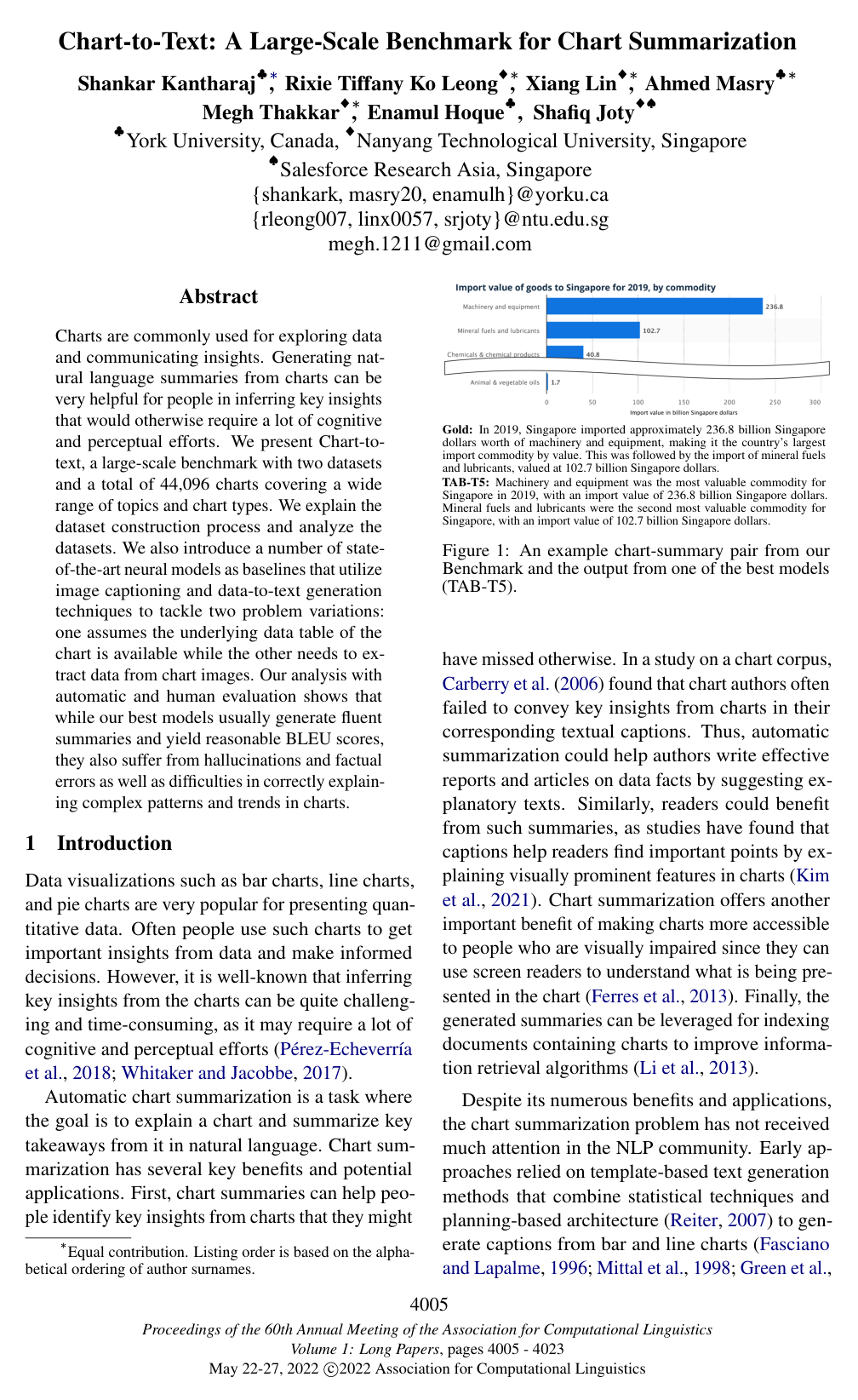
A bar chart is a graphical representation of data that uses rectangular bars to compare values across distinct categories. The length or height of each bar is directly proportional to the quantitative value, count, or frequency it represents. These bars can be oriented vertically or horizontally along a coordinate system where one axis displays the discrete categories being compared and the other axis provides a calibrated numerical scale. Widely used across statistics, business reporting, and scientific research, bar charts provide an intuitive visual method for analyzing differences, rankings, distributions, and patterns among distinct groups.

1 item

Chart-to-Text: A Large-Scale Benchmark for Chart Summarization

Chart-to-Text: A Large-Scale Benchmark for Chart Summarization

Shankar Kantharaj, Rixie Tiffany Ko Leong, Xiang Lin, Ahmed Masry, Megh Thakkar, Enamul Hoque, Shafiq R. Joty

OrganizationsNanyang Technological UniversitySalesforceYork University

Why you should read this

Presents a large-scale benchmark of over 44,000 diverse charts alongside state-of-the-art neural baselines to evaluate automated chart summarization from both raw images and underlying data tables.

Charts are commonly used for exploring data and communicating insights. Generating natural language summaries from charts can be very helpful for people in inferring key insights that would otherwise require a lot of cognitive and perceptual efforts. We present Chart-to-text, a large-scale benchmark with two datasets and a total of 44,096 charts covering a wide range of topics and chart types. We explain the dataset construction process and analyze the datasets. We also introduce a number of state-of-the-art neural models as baselines that utilize image captioning and data-to-text generation techniques to tackle two problem variations: one assumes the underlying data table of the chart is available while the other needs to extract data from chart images. Our analysis with automatic and human evaluation shows that while our best models usually generate fluent summaries and yield reasonable BLEU scores, they also suffer from hallucinations and factual errors as well as difficulties in correctly explaining complex patterns and trends in charts.

Added

2026-09-26